Here's the tech post and a forum announcement.

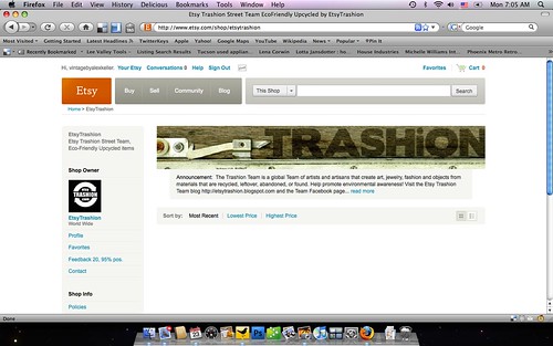
Here's a screen shot of our team page.
Note the change in the placement of the banner.
I believe it is the same size, just moved over a bit.
There are lots of changes in the shop announcement,
with a run - on structure and a pop - up box.
If your announcement is longer than space allows, you will have
a 'read more' link. Links in the announcement do not work until
you click on the announcement and get the pop - up box.
Sellers have been deleting their banners, changing their
announcement to fit the space or deleting that, too.
I also just noticed with the team shop, that when you have no
sections, the avatar is closer to the top. If you deleted your
banner, would you delete your sections, too, to get your avatar
closer to the top?
For further discussions, take a look at 'wider pages' in the forums.
How have you changed your shop?

6 comments:
Great article. Two things to keep in mind. By deleting the shop announcement and/or title you lose valuable SEO information. It may look better but you may see a decrease in off Etsy traffic finding your shop.
But I like my banner! Good article Alex! You are so "on top of it"!
The only I changed in my announcement is I shortened it a bit. But I think if people really want to read it they will click on the read more button. So I really didn't change anything I like the new look myself, less clutter.
I like the new format! The only change that I did was to shorten my shop announcement so that I do not have a "read more" button. I love my banner and will be keeping it - it's like my store front!! :)Michelle @ Wingsofflutter
I am leaving my banner and you should remember that your shop announcement is what Googlebots pick up.
Thanks for the reminder, I went and changed mine today!
Post a Comment